The Psychology of Logo Design

Explore how colors, shapes, and typography influence the way people perceive your brand. Learn what makes great logos like Nike and Starbucks so effective.
Understanding the Power Behind a Logo
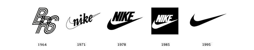
A logo isn’t just a graphic — it’s a psychological shortcut to your brand identity. Within seconds, your audience forms an impression based on color, shape, and typography. The most successful brands in the world understand this. Think of Nike’s swoosh — it conveys motion, speed, and energy without a single word. That’s design psychology in action.
Color and Emotion
Color is one of the strongest emotional triggers in design. It sets the tone before the audience even reads your name.
Red conveys energy and urgency — used by brands like Coca-Cola and Target.
Blue suggests trust and reliability — a reason why banks like Chase and tech companies like Dell use it.
Green reflects growth, balance, and sustainability — seen in Starbucks and Whole Foods.
Choosing your brand colors isn’t just an aesthetic decision; it’s a communication strategy.
Shape and Form
Shapes can communicate meaning just as powerfully as colors. Circular logos (like BMW or Pepsi) feel friendly and inclusive, while angular shapes (like Adidas or Mitsubishi) project stability and strength. The subtle geometry of your logo guides how people feel about your business.
The Takeaway
A well-designed logo isn’t random — it’s a strategic mix of psychology and creativity. When done right, it builds emotional connection and instant recognition.
Ready for a logo that truly connects with your audience?
Let’s create one together at WeCreateDesigns.com
Keywords: logo design psychology, brand identity, color theory, shapes in design